Every run opens the same eleven sheets, from a Europe-wide overview down to a single hour in a single market. Here they are in the order you would actually use them, taken straight from the running app.
Start from one of three scenarios built on national plans and the decided pipeline (Accelerated, Current Trends or Delayed Transition), then bend it to your thesis. Commodity prices, demand growth, nuclear availability and storage are all live controls. No support ticket, no black box.
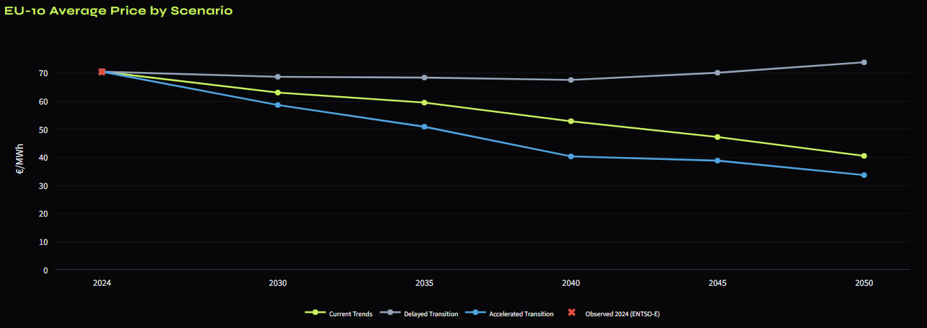
History and forecast for all 10 markets on one chart, with a P10 to P90 weather band around each, so you can see how much of the movement is just weather. The EU-10 average falls from ~73 €/MWh in 2024 toward ~68 €/MWh by 2050 in the central case, every year in 2024 euros.
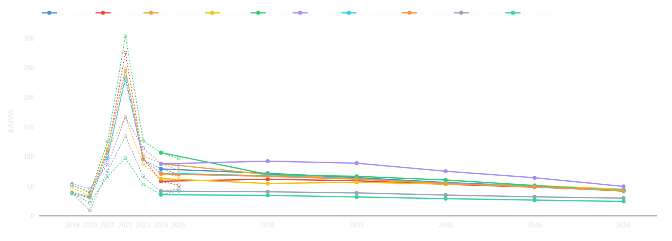
Run all three scenarios at once and read the spread on the metric your returns depend on: the wholesale price your assets capture.
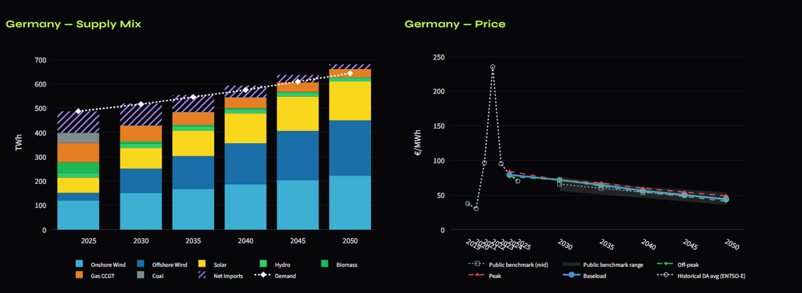
Drill into any single market: the generation mix that clears each year, the price-duration curve behind the average, and how the daily profile deepens into a duck curve toward 2050.
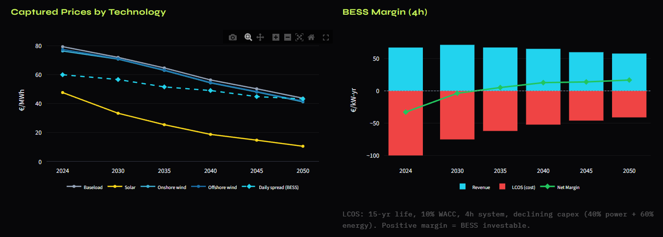
Technology-specific capture prices and battery day-ahead spreads, year by year. This is how much of the baseload price a solar, wind or battery asset actually realises as the fleet around it grows.
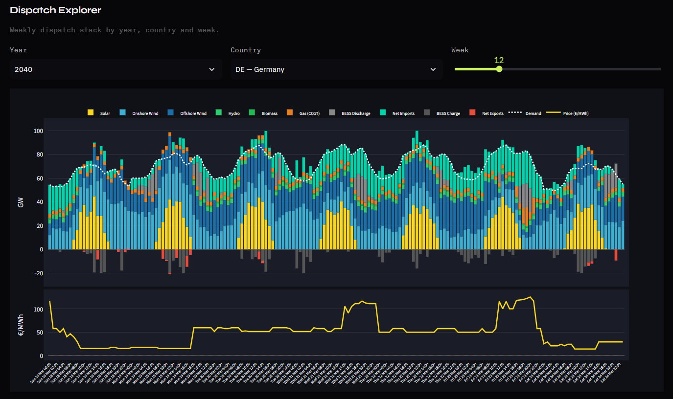
The hourly generation stack for any week, market and year. You can see exactly what sets the margin as batteries charge into the midday solar trough and gas steps in at the evening peak.
The step most price-curve vendors leave to you. Define the asset — technology, market, capacity, COD, CAPEX, OPEX, WACC — and PowerLens runs it straight through the hourly curve it just built, hour by hour, year by year, to NPV, IRR, LCOE and payback.
Not just merchant. Model 100% merchant exposure, a fixed-price PPA, a two-way CfD, a 50/50 blend, or a floor/collar that clips the hourly price to a protected range.
At your WACC, your tax rate, and CAPEX booked either upfront or annualised via CRF. Solar, wind, BESS arbitrage and Solar + BESS hybrids are all first-class.
Price level, volatility, capacity factor and shape are all re-drawn across thousands of paths, so the answer is a spread of IRRs with a P10 and a P90 — not one number to argue about.
Unlevered, and we say so. Cashflows are discounted at WACC. Debt sizing — DSCR, LLCR and levered equity IRR — is not modelled, so the output sits alongside your financing model rather than replacing it.
The same run also carries a weather-uncertainty ensemble and a one-click data export — so a screening view and a data-room deliverable come out of the same engine.
A Monte-Carlo weather ensemble re-runs the model across windy/calm and sunny/dull years, aggregating to a P10 / P50 / P90 range around the central curve.
Hourly prices, the full KPI table and the assumptions snapshot, one click away as CSV / XLSX, every file stamped with the model version and source fingerprint, straight into your financial model or a data room, no re-keying.
Not a capacity-expansion model. Capacity is an input, not an output. Build-out pathways from national plans, the decided pipeline and TYNDP are selectable, and refinable per technology, so you can see exactly how much of the price outcome the capacity assumption drives. That, and every other known limitation, is stated up front: see how we stay transparent.
Book a 30-minute demo and we'll run your market, technology and horizon live — then hand you the curve.